
This image is all I can think about right now. Perhaps somehow I can write out the horror that consumes me.
Ok! So. Safe.
The Voice called it "the best film of the decade." The more I think about it, perhaps the more I can understand that perspective.
In describing it to a friend, I called it not so much a movie, but really more of a two-hour long modern painting or photograph, something that exists solely for its purpose as a vehicle to simulataneously communicate and critique a specific world. His use of hyper-accurate details demonstrate that the content of his subject proves to be the best weapon with which to attack it.
In this case, the subject is wealthy suburban SoCal, and we open with a full 45 minutes of shots that remain relentlessly distanced from the characters. Sound operates on a minimum of three layers at all times, washing the world into a blur of input, giving the audience a plethora of cues from the society we are immersed in, but forcing us to cling to these details, as we are provided with zero plot, and scant facetime with our protagonists.
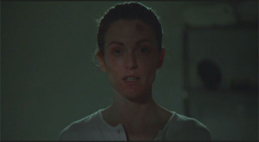
This void of plotline, and the searching that results from one's lack of emotional engagement, perfectly mirrors Moore's experience in the film: she is lost, confused, hyper-aware, emotionless. She is living in a world full of details, and it is obviously and painfully empty. That emptiness retains an inevitability, an inescapable quality, as if it were a prediction of the future, impossible to avoid. For me, the force of Haynes' world stems from this inevitability. Whether one examines the lives of his characters, or the way he shoots their world, everything screams emptiness, void, and loss. Throw in the fact that this is the past, and has already happened, and the crushing inescapability is reinforced once again. Indeed, the metaphor of shortness of breath is an accurate physicalization of Haynes' view on suburbia. It is the illusion of freedom, and never do we see this freedom in any context other than viciously restrained and boxed-in, its characters framed within the windows, cars and angular houses they have chosen to live in.
It made me think much more about the choices one makes as a cinematographer, in terms of placement within a film of certain aesethetic elements. Say, of a well-composed and extremely studied wide shot. Putting it in the beginning of a film says something very different than delaying its first appearance until a key plot point develops. After having recently seen Little Children, I cannot help but examine my own aesthetic leanings (cinematographicly) from a new perspective--one that connotes much more responsibility with each choice. It is as if I have suddenly realized that I cannot merely "have fun" with my kids, but must also think about what games we play and what that teaches my child about the world. Time to be a responsible parent. Time to take my skills a little more seriously. Most importantly, time to shoot!
-eric p-h
p. freakin' s.
there is a *ridiculously* Web 1.0 site for this movie, clearly made in 1995 actually. Check it out in depth. It will not disappoint. Reminds you of a different era.

No comments:
Post a Comment